

Jump directly to main navigation Jump directly to content
LAYOUT: CENTER

Centered Hero

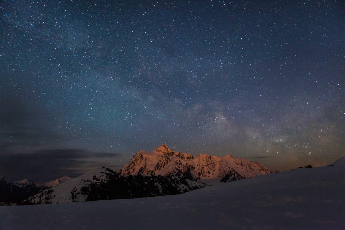
Text over a background image, centered horizontally and vertically. Classic marketing hero.

LAYOUT: START

Split Hero on the left

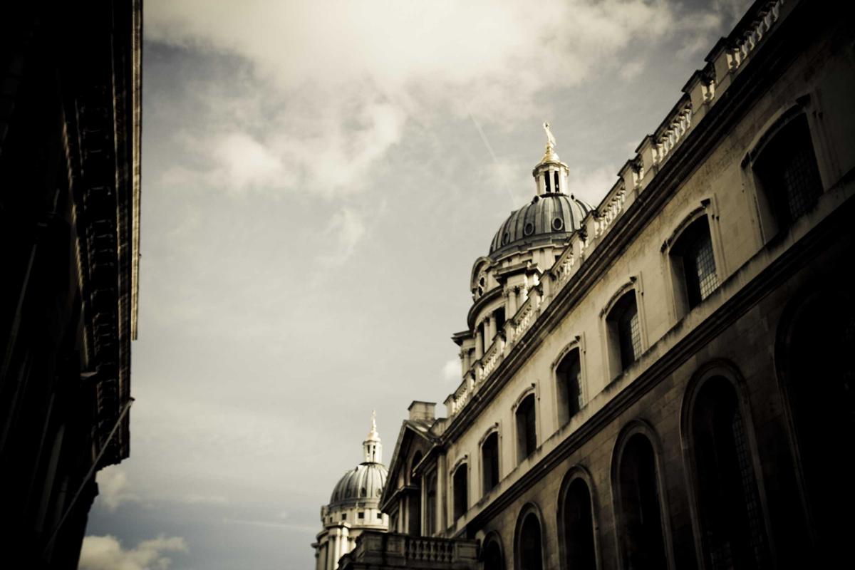
Text on the left side, image on the right. On mobile devices, they are stacked vertically (text at the top, image at the bottom).

T3Bootstrap v14 Backend Preview
LAYOUT: END

Split Hero (right)

Mirrored relative to start — Image on the left, text on the right.

LAYOUT: FULL

Full-Screen Hero

Spacious layout — full-screen background, text left-aligned above the image.

BG-STYLE: COVER IMAGE

Cover Image

Full-screen background image with a dark overlay to improve text readability.

BG-STYLE: IMAGE-DECORATIVE

Decorative Image

Brand-Color-Panel with a subtly placed image on the right.

BG-STYLE: GRADIENT

Gradient

Color gradient from --ds-primary to --ds-primary-active. No image required.

BG-STYLE: SOLID-PRIMARY

Solid Primary

Plain Brand-Color, simple.

BG-STYLE: SOLID-DARK

Solid Dark

Dark panel, sophisticated and high-end.

BG-STYLE: DEFAULT

Default

Backward Compatibility: The background comes from the layout class. Here, "Layout" center—that is, Brand-Color.

Hero (Produkt)

Hero-Variante mit Produktbild-Overlay. Ideal für Produkt-Landingpages mit visuellem Highlight.

Four hero layout variations in tx_heroitem_layout (center, start, end, full) and six background styles in tx_heroitem_bg_style. Plus: Header layout variations via Site Settings.

Layout: center

Text centered on a background image. The default option for classic marketing hero sections.

Layout: start

Split: Text in the left column, image on the right. Recommended for product hero pages and landing pages with a clear visual.

Layout: end

Reversed split: image on the left, text on the right. An asymmetrical variation for storytelling heroes.

Layout: full

Full-screen overlay — Text in a wide column over the background. For a premium presentation with a large image area.

Background Styles

The field tx_heroitem_bg_style offers six styles that can be combined with any layout—from a full-width image to a dark solid panel.

Header Styles

The page header (logo + main navigation) can be configured in four basic styles. This can be toggled via Site Settings navigation.main.menuType in combination with header.layout.

Standard — Logo on the left, navigation on the right

Logo

Content

Application: Classic corporate layout. Default version.

Centered — Logo centered, navigation below it

Logo

Content

Usage: Editorial, magazines, publishing houses. Strong emphasis on the brand.

Transparent — superimposed over Hero, logo and navigation in white

Logo

Hero Area

Usage: Hero-focused sites — The header hovers transparently over the hero and becomes opaque as the page is scrolled.

Sticky — stays at the top while scrolling

Logo

↓ The header stays fixed at the top when scrolling (with a shadow).

Use: Long-form pages, one-page sites with a long section index navigation. Improves accessibility of the navigation.

Configuration

Hero layout variants are defined per CE using the fields tx_heroitem_layout and tx_heroitem_bg_style ; header styles are controlled globally via Site Settings:

tx_heroitem_layout

center, start, end, full

tx_heroitem_bg_style

image-cover, image-decorative, gradient, solid-primary, solid-dark, default

tx_heroitem_color_inverted

Enable light text on a dark background

heroButtons (inline)

Foreign table records with label, link, variant (primary/light/outline), icon

heroMetaItems (inline)

Trust items below the buttons (label + icon)

navigation.main.menuType

Rendering engine for the main navigation (smartmenus, bs5, mmenu)

header.layout

Standard / Centered / Transparent / Sticky
Variant: Minimal

Variation: Image Focus

Variation: Countdown

Variation: Centered logo

Variation: Hero with text

Variation: Split Text/Image

Lizenz kaufen